As an admin you can add a form to service-resources or scheduled-resources. Once created and saved, the form will be displayed in the booking window and each user is required to fill in the requested information when making a new booking.
¶ Adding and modifying a form
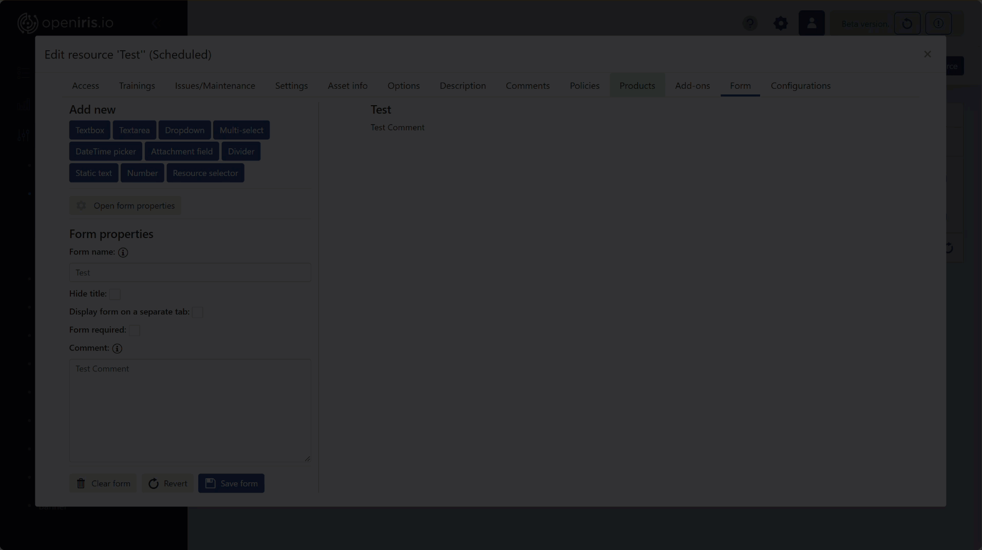
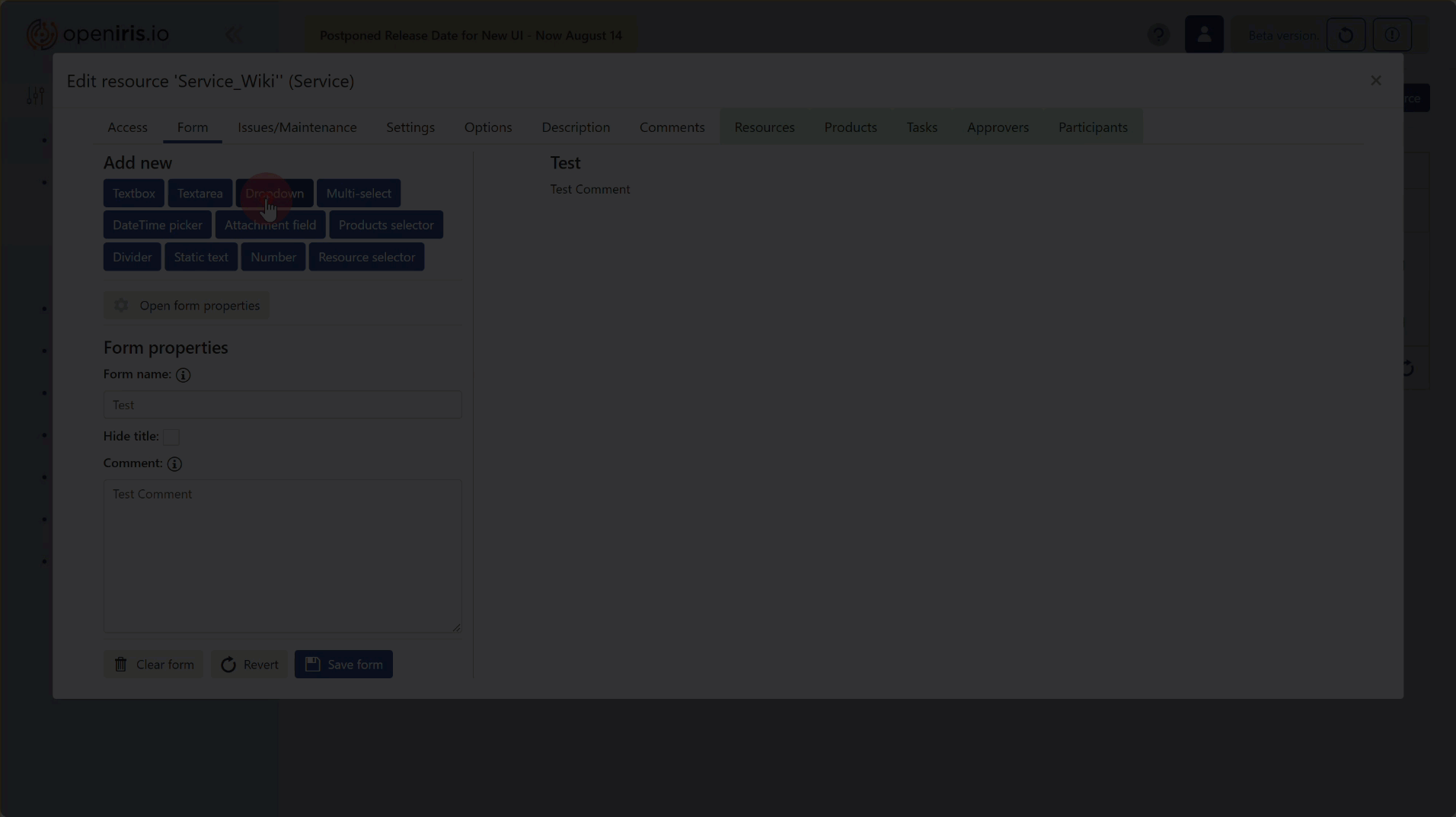
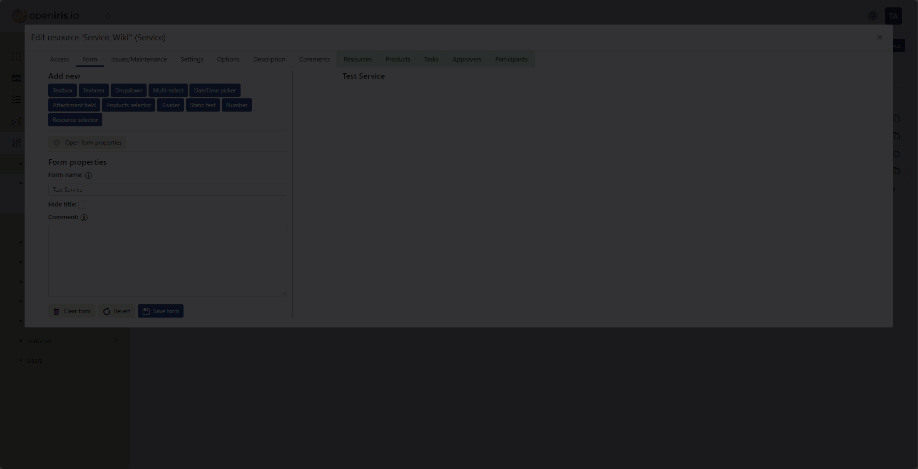
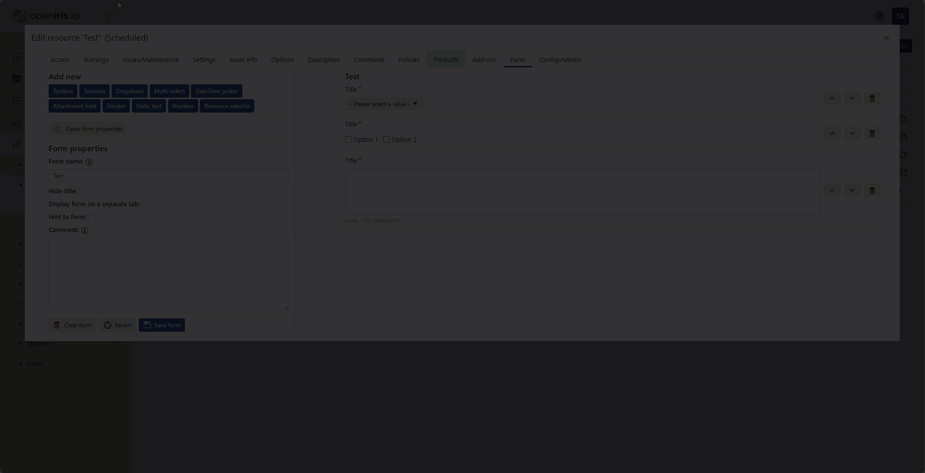
Forms can be added via the the settings dialog [resource] > manage (gear icon) > Form (tab).
It is required to give the form sheet a title, which can be hidden from the user by ticking the box Hide title. You can also add a comment which will be displayed as static text below the title. Afterwards, different elements, such as multiple choice or freetext questions can be added to the form by clicking on the blue boxes below Add new. By clicking on Open form properties you can go back to to editing the title and comment.
Instead of creating an entirely new form, it is also possible to copy and adopt the form from any resource you are provider admin of. To utilize this option, click on copy an existing one instead of creating a new form in the first step. Then select the desired from the drop-down menu and click Copy. Afterwards the form will be loaded and you can rename or adjust it to your needs.
 |
|---|
Edit resource > Form (Tab) and adding a new form |
By default every new element will be inserted at the bottom of the form below the previously added elements. To change the position, use the arrows on the right end of the element OR drag and drop the element to a new position within your form. To delete an element click on the trash bin symbol to the right of the element. You can edit each element by clicking on it. The element properties will then become visible in the lower left corner of the window.
After having added and modified new form elements it is very important to click on Updateand then Save form. Otherwise the modifications will not be saved and lost once you close the form.
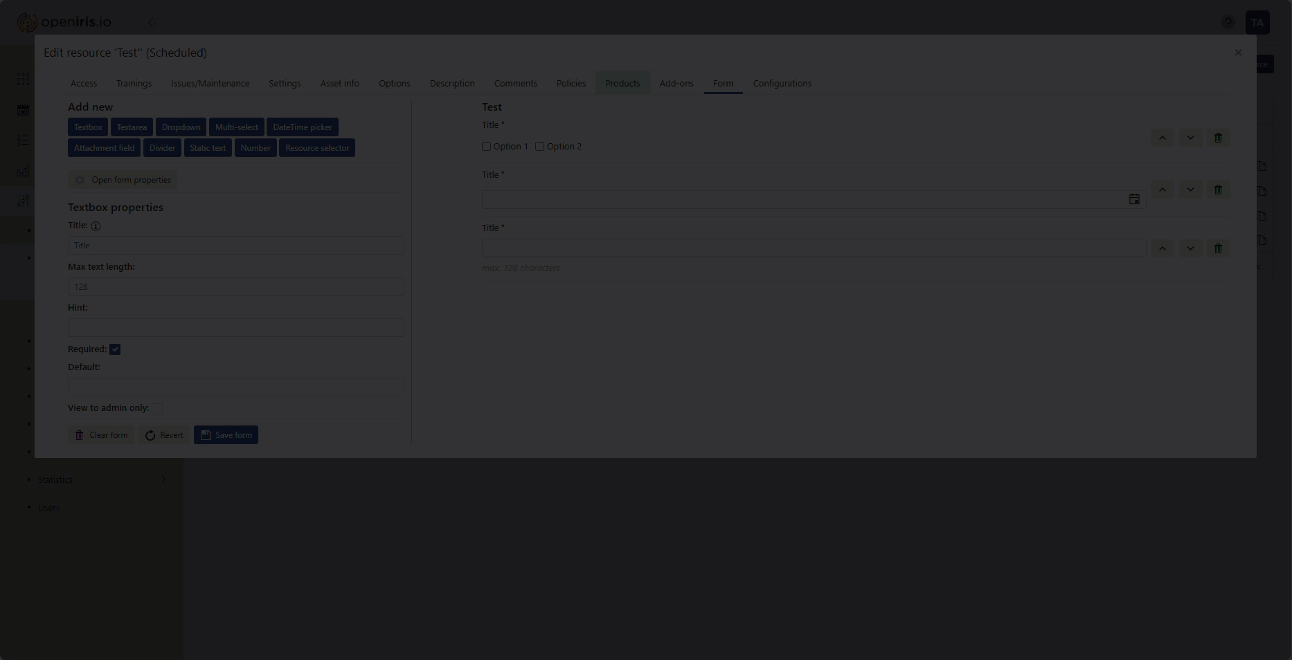
¶ Textbox
 |
|---|
Adding a Textbox element to a new form |
A textbox is a short element where users have to insert text. The title is displayed next to the textbox. The maximum length limits the amount of characters that can be used in the textbox. The hint is a static text displayed below the title in italics (e.g. for important additional information). If you tick Required this field gets marked by a red star and must be filled out by the user. In the "Default" field below you can set a default text that is displayed if the field is not filled out. If you tick "View to admins only" this field can only be seen by admins (please note that the field will then not be seen by normal users and therefore cannot be filled out by them).
¶ Textarea
 |
|---|
Adding a Textarea element to a new form |
The textarea is similar to the textbox and can be added if users are requested to answer questions in form of longer texts. In addition, it is possible to define the number of rows, which are displayed to the user in the final form.
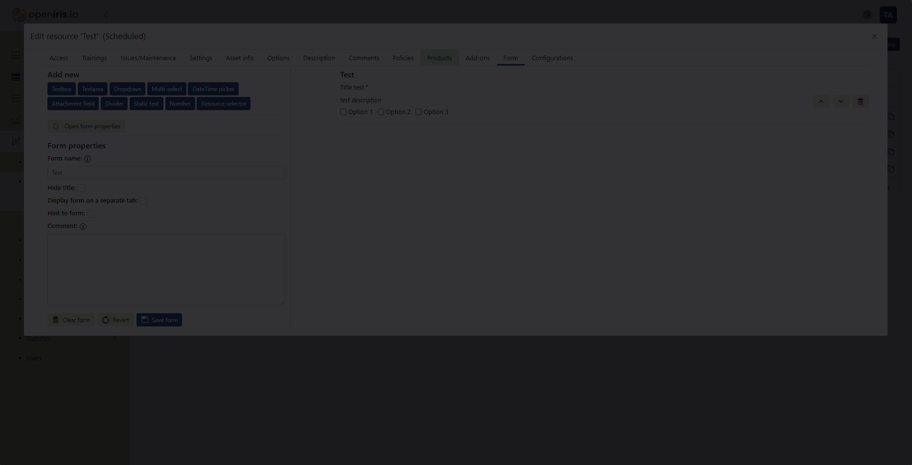
¶ Dropdown
 |
|---|
Adding a Dropdown element to a new form |
A dropdown menu can contain multiple items of which users have to select one option. A new option to select from can be added by clicking on Add after filling out Titleand Value.
By clicking on the pen-symbol next to the diferent options, you can change the title and value of these. With the blue arrows it is possible to change the position of the listed options, while the red X-symbol removes them from the drop-down menu. Please be reminded to always click on Update after finishing the editing.
¶ Multi-select
| |
|
|Adding a Multi-select element to a new form|
A multi-select element gives users multiple options to select from by ticking the boxes. The individual items can be edited the same way as the items of the drop-down menu described above. Additionally it is possible to define the maximum number of selectable items from the provided list.
By giving only one option to choose from and marking this question as mandatory, it is also possible to use this feature to confirm that users have read and agreed to the terms & conditions linked to using this service/resource.
¶ DateTime picker
 |
|---|
Adding a Datetime picker element to a new form |
The DateTime picker gives you the option to pick a specific date. If the box Display time is ticked, the user can also choose a specific time.
¶ Attachment field
 |
|---|
Adding an Attachment field element to a new form |
The attachment field allows the users to upload a document into the form.
¶ Product selector
 |
|---|
Adding a Product selector element to a new (service) form |
The product selector can only be added in forms for services. It allows provider admins to add a list of products, which users are able to select from. The products list can be added or edited by clicking on Add/Edit product list. Once users have selected one or more products in the form, the selected items and the total price thereoff are displayed in the form sheet. New products can be generated or modified under the Admin (menu) > Products (tab).
Additional features of the product selector are the option to suppress description, show only totals in quotes and chargesand to suppress comments.
Information on how to create and configure products can be found here.
¶ Divider
 |
|---|
Adding a Divider element to a new form |
The divider is a horizontal line, which can be used to divide the form in subsections and thus give more clarity. The divider can be labeled with a title and a hint. It is also possible to indent the content following the divider (tick Indent) or end the previous indent (tick Stop previous indent). If you just need a bit of blank space between the elements it is also possible to not display the line by removing the tick from Display line.
Dividers can also be used to expand and collapse grouped questions and thus increase the overview of the form. For this, include one divider above the questions you want to group and select the option Start panel bar. Afterwards add a second divider below the last question of the group and select the option End panel bar.
¶ Static text
|
|---|
Adding a Divider element to a new form |
This element can be used to give the users some important information or include hyperlinks. Users cannot change this text when submitting a request. The title and/ or the text can be written in bold by ticking the corresponding box.
¶ Number
 |
|---|
Adding a Number element to a new form |
The number field lets the users select a number with an incrementer on the side. Besides the title and the hint, it is also possible to define the minimum and maximum values which can be selected.
¶ Resource selector
 |
|---|
Adding a Resource selector element to a new scheduled form |
¶ Finalising the form sheet
After finishing all changes to the form, please keep in mind to click on Save if you want to keep the changes you made. Please note that by simply clicking on Close without saving, all changes will be lost.
The Revert button resets the form to the last saved version. Clear formremoves all added modules and texts and generates a new plain form.
¶ Show forms in a separate tab
If your scheduled resource has a very long form it may be unhandy to show the whole form below the usual booking window. Therefore it is possible to go to the form properties (see beginning of this page) and tick Display form on a separate tab. Now the booking window will consist of the normal booking tab and an additional tab for the form. This option is only available for the form sheets of scheduled resources.
 |
|---|
| How to make a form open in a separate tab |